The Trials and Tribulations of Writing a 3rd Party iOS Keyboard
Nov 8, 2014 programming
I recently released my first commercial project: Translit Keyboard, a 3rd party keyboard for iPhone that lets you transliterate Latin characters into Cyrillic and some other alphabets. When I was first investigating this problem, around the time that iOS 7 came out, I discovered that I could implement an elegant solution in OSX using the lesser-known Input Method Kit. My program sat between the keyboard and text field; the framework provided me with each raw character as it was entered, and I could either pass it along with the default behavior, or instead take control of the output and send off whatever I pleased1. Sadly, iOS was off-limits: since 3rd party extensions weren’t even on the radar at the time, there was nothing anyone could do to enable this sort of behavior system-wide. The only solution was to make a nice app with a special text field that you could copy and paste from — too clunky for rapid-pace tasks like messaging.
When iOS 8 was announced and unexpectedly blew open the doors on extensions, my interest was immediately piqued. Although, on initial glance, the keyboard APIs were rather crude — you were given a gray box at the bottom of the screen and practically nothing else — this gave me a roundabout “in” to making input methods work on iOS. What if I were to recreate the system keyboard from scratch? I could make it behave any way I wanted!
And so, Tasty Imitation Keyboard was born. If I may take a moment of vanity, the keyboard is very solid: on most phones, it looks and types very much like the system keyboard, minus the landscape side buttons on the 6 and 6+. (iPad support isn’t too high on my priority list, but it is functional.) This was a satisfying project to work on, giving me great insight into Swift, autolayout (since removed), Core Graphics, and a bit of Interface Builder. But it also gave me experience with something that I had yet to encounter in my sheltered iOS development existence: the horror of undercooked Apple frameworks and tools.
Below are as many of the problems I encountered during development as I can remember. I have high hopes that these will be fixed over the next few years, but until then, perhaps this article will help some poor programmer in dire straits!
Behavioral Bugs
Prevalent in Apple land is the expectation that software should adhere to the conventions of its host OS. We like our apps to use common widgets, behave consistently, react smoothly, and acknowledge the current design trends; very much unlike the “anything goes” philosophy that Windows and Android have often adopted. So it surprises me that 3rd party keyboards are even a thing on iOS. To take such an essential, constantly used, frequently visible UI element and put it at the mercy of developers — many with their own twisted ideas of how a keyboard should look — seems like a very un-Apple-y thing to do.
But it gets worse. 3rd party keyboards on iOS don’t just have the opportunity to look alien; they act alien, and this is something that programmers can’t guard against. Consequently, all the 3rd party keyboards currently available on iOS feel like some sort of jailbreak hack.
That Pop-In
This is the first thing you notice. Unlike the system keyboards, which smoothly slide in from the bottom of the screen, 3rd party keyboards just… pop into existence. (Most of the time. Sometimes they slide in, though it’s hard to predict when this will happen. There are also some scary bugs associated with this particular entrance. More below.) Worse, if you’re switching from a default keyboard to a 3rd party keyboard, the entire keyboard disappears for a second while the 3rd party keyboard loads up.
Invalid State
And guess what? Sometimes you’ll have to wait forever!
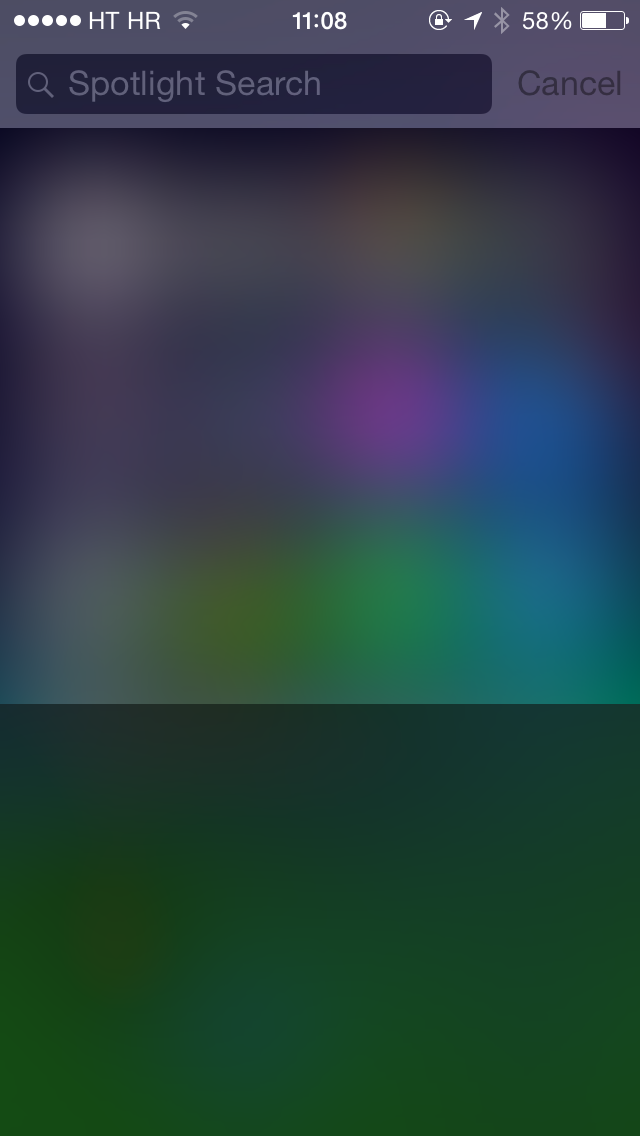
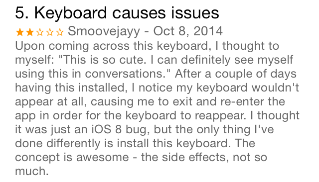
On occasion — frighteningly frequent occasion — I’ve seen the keyboard simply fail to appear, even after waiting for many seconds. When this happens, it’s hard to tell when the keyboard is going to come back. Will it happen when you hit the home button and re-open the app? (Sometimes it doesn’t.) When you switch to another app? (Sometimes it doesn’t.) One of the few sure-fire ways to fix this problem is to force-close and re-open your current app, which isn’t always possible. (Spotlight.) And until then, have fun not being able to type!
There are other fun states that your keyboard can get into. For example, sometimes the keyboard view will show up, but never actually load the keyboard:
And the fun is not just limited to 3rd party keyboards! If you hit the globe icon on a system keyboard, sometimes the button will run away from under your finger — and stay that way for a long time:
What Is the Text Even Doing?
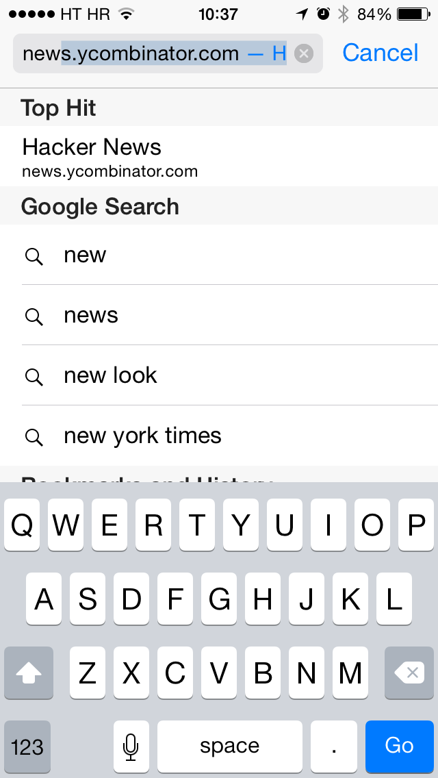
The text entry behavior of 3rd party keyboards is a bit erratic. For example, try using SwiftKey (or any other 3rd party keyboard) to type out part of a saved URL in Safari — to the point where it starts to autocomplete the rest — and then press delete. You’d expect the highlighted part to disappear, right? No: what actually happens is that the cursor simply moves to the left, leaving the autocompleted part intact and still highlighted. This does not happen with the system keyboard.
Settings? What Settings?
With 3rd party keyboards, you can’t access any of the keyboard preferences that the user has set, including auto-capitalization, automatic spaces after periods, disabling the shift key, and playing clicks when typing. As a result, you either have to assume a default, or re-implement the settings entirely.
(Fortunately, accessibility settings like “reduced transparency” are still available.)
Broken Apps
Some apps are downright broken with 3rd party keyboards.
Editor’s note: None of the problems below seem to happen anymore with Google’s recent Maps redesign. Still, the fact that they were happening at all is troubling, since there’s nothing an app should theoretically be able to do to influence keyboard behavior.
In Google Maps, a number of strange behaviors happen with the search box. First, it’s one of the few text fields I’ve seen that have custom keyboards slide back in after they’ve been dismissed, rather than just popping in as described above. Why this particular text field and not others? I have no idea. Furthermore, if you track the UIInputViewController lifecycle during this process, you’ll see that even though viewWillAppear is called correctly when this happens, viewDidAppear is not. This is especially odd given that the keyboard still appears to go through init.
Next, if you tap on the search field in portrait and then rotate to landscape, your keyboard will suddenly expand almost to the top of the screen.
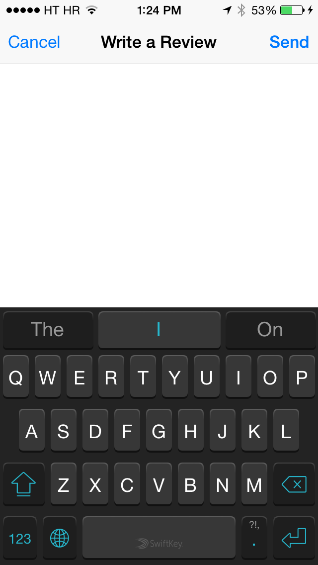
How about another app? Hilariously, in the App Store app, if you try to write a review using a 3rd party keyboard, you’ll find that the page turns entirely blank!
Reloading the Extension
If you’ve recently updated a 3rd party keyboard, your apps might still have the old keyboard bundle loaded in. This is fixed by force-closing and reopening the app.
Mystery Crashes
I have seen numerous mystery crashes affecting their 3rd party keyboards. Sometimes they just… close for no reason. And you don’t even necessarily see it in your crash logs!
Mystery Glitches
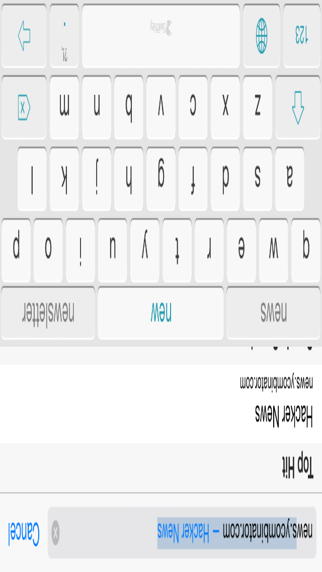
3rd party keyboards can sometimes exhibit bizarre graphical glitches. For example, this one is easy to consistently reproduce.
Missing Features
There are some features that customers are used to — or even find essential! — in their keyboards, but that we cannot currently provide. One is autocorrect, including the red-squiggle variety. Another is physical keyboard support.
Full Access Is Almost Necessary
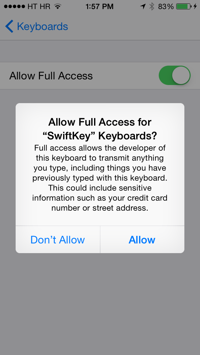
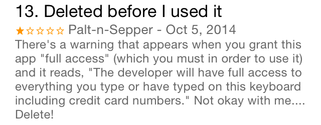
There are two ways that 3rd party keyboards can run. By default, the keyboard cannot do much of anything outside its own sandbox. But if the user goes into their settings and manually flicks a carefully hidden switch, they can enable “full access” for that particular keyboard. In the process, they are greeted with this terrifying popup:
This totally makes sense if there’s a chance that your keyboard could send your precious keystrokes over the net. Unfortunately, there are a number of other vital features that require getting past the full access barrier. Sharing data between your keyboard and your container app. Sharing data between multiple keyboards in a single app. Having a settings bundle. Using in-app purchases with your keyboard. Playing sounds, for crying out loud. Some of these are reasonable since they could allow private data to escape out of the sandbox in roundabout ways, but it’s causing many developers to strongly encourage their users to enable full access.
I wanted to be as secure as possible in my app, so I worked around these problems in various ways. To compensate for the demo aspects of IAP, I released my app for a fixed price, and then released a Lite version with a useless transliterator (Old Slavonic) for trial purposes. Instead of having a single keyboard with a language selector accessible from the container app, I opted to have multiple keyboards instead. The one feature in my keyboard that still requires full access is sound; this defaults to “off” in the in-keyboard settings and offers users an explanation on how to enable it.
The Reviews; Oh, the Reviews!
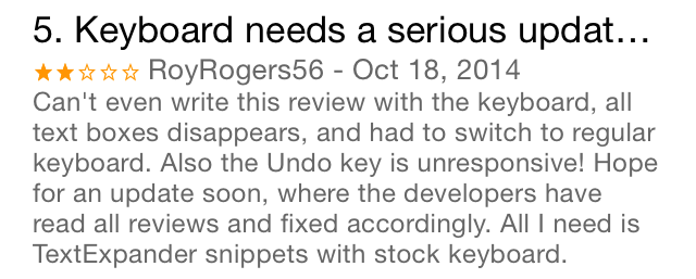
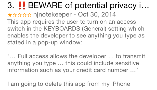
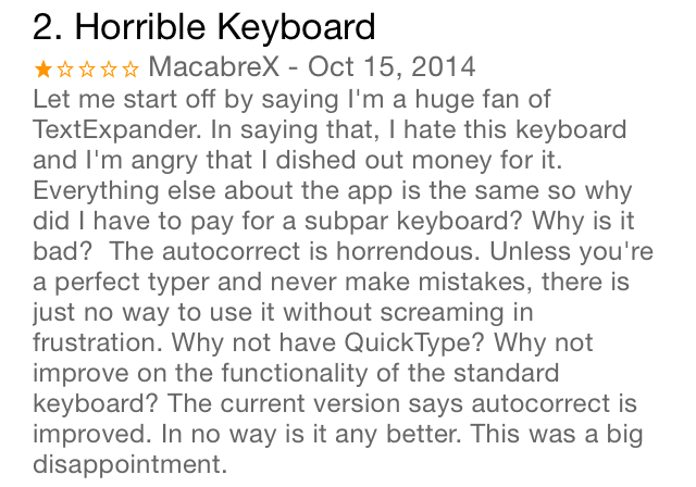
As you would expect, customers have no idea that any of these behaviors are caused by the OS. Just look at these reviews for various 3rd party keyboards:
You’ll find it difficult to find a 3rd party keyboard with more than 3 stars. (And can you blame the customers? After seeing these behaviors, I certainly wouldn’t switch to a 3rd party keyboard full-time!)
What can we do about this? Nothing! We have to pay for these bugs with our precious developer cachet.
Programming Problems
In addition to the above hassles, us programmers have other things to worry about. The framework that Apple has given us is… rough around the edges.
Changing the Height
Unlike the system keyboard, your custom keyboard is confined to the rect it was created in. There’s no drawing outside the box and no adding transparency. This becomes a problem if you want to add popups to your keys like the ones in default keyboard. How do you handle the top row when you can’t draw over the top?

In the early betas, you couldn’t do much at all. Your best option was to either draw sideways popups or just do nothing. Closer to release, we got the ability to expand the height of the keyboard view. Sadly, the implementation feels like an afterthought.
Apple specifies in the docs that you can change the height of your keyboard by adding an autolayout constraint with a constant value to the keyboard view. However, if you actually follow these instructions, you’ll find something like this in your log:
2014-11-08 17:17:09.741 Keyboard[8079:3155417] Unable to simultaneously satisfy constraints.
	Probably at least one of the constraints in the following list is one you don't want. Try this: (1) look at each constraint and try to figure out which you don't expect; (2) find the code that added the unwanted constraint or constraints and fix it. (Note: If you're seeing NSAutoresizingMaskLayoutConstraints that you don't understand, refer to the documentation for the UIView property translatesAutoresizingMaskIntoConstraints)
(
    "<NSLayoutConstraint:0x618000096350 'UIView-Encapsulated-Layout-Height' V:[UIInputView:0x7fe0be909690(216)]>",
    "<NSLayoutConstraint:0x608000093b50 V:[UIInputView:0x7fe0be909690(246)]>"
)

Will attempt to recover by breaking constraint
<NSLayoutConstraint:0x608000093b50 V:[UIInputView:0x7fe0be909690(246)]>

Make a symbolic breakpoint at UIViewAlertForUnsatisfiableConstraints to catch this in the debugger.
The methods in the UIConstraintBasedLayoutDebugging category on UIView listed in <UIKit/UIView.h> may also be helpful.
Adding a constraint to the keyboard view doesn’t set the height; it rams against the existing autolayout height constraint created by the autoresizing mask, and overrides it in most cases. This is important: if you add the constraint before the view appears on the screen (this is specified in the docs), or in certain cases where your keyboard view doesn’t contain any subviews with autolayout constraints (this is not), your height constraint will lose and the keyboard will revert to the default height. That second case is particularly mystifying: at one point, I had to create an invisible kludge view with autolayout constraints and add it to my keyboard view in order for the height to set correctly!
But even with the extra height, you can’t actually make any part of your keyboard transparent. This means that if you want to implement popups for the top row, you either have to add an ugly strip to the top of your keyboard (my solution — it’s a good place to put extra UI anyway), or alternatively try increasing the height whenever you tap a key in the top row and then shrink it back down afterwards.
I ran into another problem with this constraint technique. For my keyboard, I didn’t really want to provide an entirely unique keyboard height; all I needed was an extra 30 points or so on top of the native keyboard height. The first idea I had was to change my height constraint from just a constant, to “equal to the keyboard height” plus 30. This did not work. Next, I tried to capture the keyboard height before I added my constraint, as well as on rotations; unfortunately, after my constraint was added, I found that this technique stopped working. (It warrants further investigation, however.) Finally, I decided to just hardcode the keyboard heights for each device and each orientation.
Speaking of which: with a custom height constraint, on rotation, everything goes nuts. I don’t think I’m doing anything too crazy. This is what my rotation code looks like:
override func willRotateToInterfaceOrientation(toInterfaceOrientation: UIInterfaceOrientation, duration: NSTimeInterval) {
    self.keyboardHeight = self.heightForOrientation(toInterfaceOrientation, withTopBanner: true)
}
…which simply sets the height constraint’s constant to the correct height.
But if you perform the rotation in the Simulator, you see things like this:
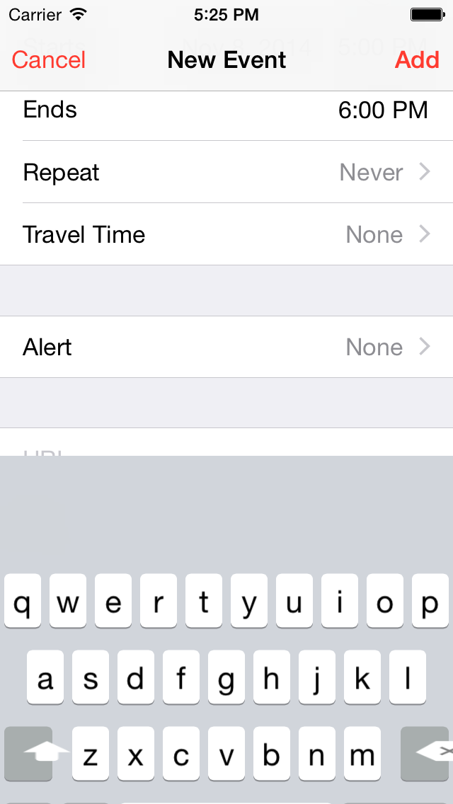
And this:
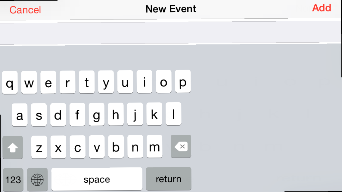
And maybe this:
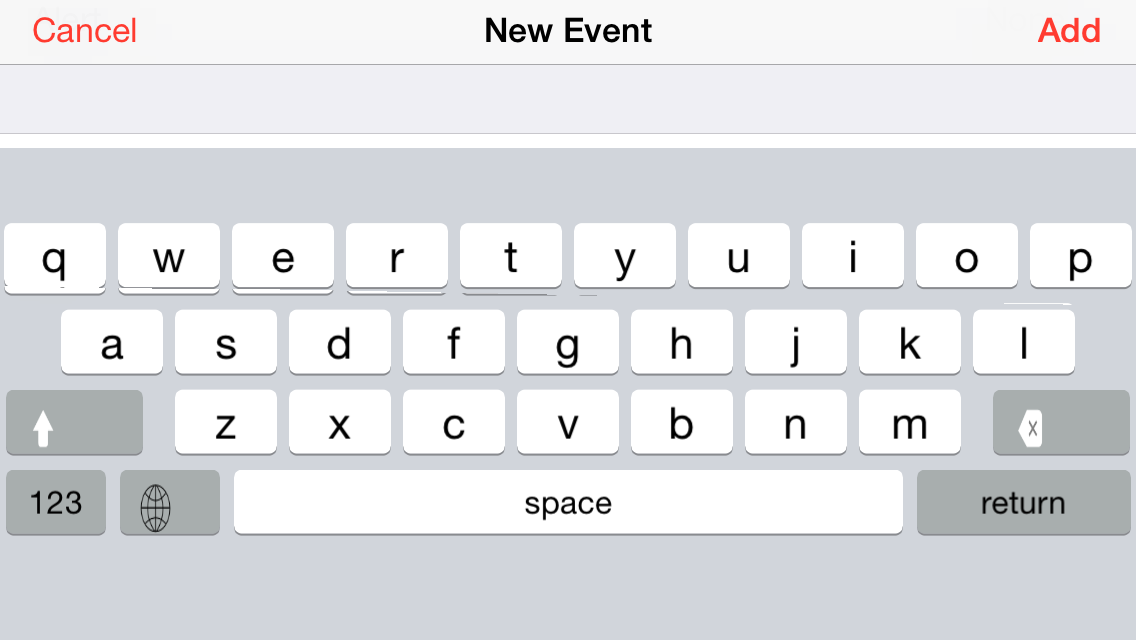
In the process of trying to figure out what was causing this, I discovered that during certain points in this transition, the bounds of the keyboard view (or its superview, or its layers) were incorrect. For example, in the second screenshot, the bounds would be 320×216, even though they’re clearly 568×162 at that point.
I couldn’t find a way to work around this issue, and so I was freaking out for a few days until I discovered that it didn’t happen on device unless your performance was really slow. With that said, if you don’t add the Apple-sanctioned height constraint, none of this occurs.
Straight-Up API Errors
The UIInputViewController class, as an adherent to UITextInputDelegate, receives several useful callbacks from the text field. You’ll notice that they’re named pretty clearly: selectionWillChange, selectionDidChange, textWillChange, and textDidChange. In fact, none of them actually do those things. The selection methods never gets called at all, and the text methods only get called — get this — when the selection changes or the cursor is moved!
(Incidentally, the UITextInput object that you get back with these methods is crippled. Many of its methods don’t seem to do anything.)
viewWillTransitionToSize is another offender. As of iOS 8, if you use the old willRotateToInterfaceOrientation method, Xcode will tell you that it’s deprecated and that you should be using viewWillTransitionToSize. However, viewWillTransitionToSize never actually gets called! You’re forced to use a deprecated method in one of Apple’s newest UIKit additions.
UITextInputTraits Transgressions
Your UIInputViewController has a mysterious NSObject called textDocumentProxy that serves as the interface between the keyboard and the current text field via the UITextDocumentProxy protocol. (Why is it a nebulous NSObject instead of a UITextDocumentProxy?) Among other things, this protocol lets you access certain attributes of the text field.
Perhaps the most important of these is keyboardAppearance, which tells you if your keyboard should be using dark mode or not. One would expect this value to be correct on keyboard initialization, but no: you actually have to wait for the keyboard to appear on screen before this field populates with the correct value. I have not tested, but I have a hunch this applies to the other input traits as well. To my knowledge, this is not described in the documentation.
The properties of UITextInputTraits may change while the keyboard is still open, if the user switches from one text field to another. This is pretty sensible, if uncommon. What’s not sensible is that the textDocumentProxy object is not KVO compliant, meaning that there’s no easy way for you to observe these changes! The only thing you can really do is poll the object, 60 times a second. (I’m not suggesting that there’s a performance penalty for this, but still… yuck.)
Audio
As mentioned above, you need to enable full access to get any audio going. You would think, at least, that you could call the standard AudioServicesPlaySystemSound function to play the keyboard tock; but instead, you have to do this:
dispatch_async(dispatch_get_global_queue(DISPATCH_QUEUE_PRIORITY_DEFAULT, 0), {
    AudioServicesPlaySystemSound(1104)
})
And yes, that dispatch_async is necessary; otherwise, your keyboard will simply stop working if full access is disabled.
iPad Woes
This is more sensible than the other issues, but I still think it’s worth mentioning. If you want to sell an iPhone-only keyboard… well, you kind of can’t. True, the app won’t show up in the iPad App Store; but if you install the container app on your iPad, you’ll still be able to install the keyboard in the settings! This is especially a problem if users find your app via your product website rather than through the App Store, since they probably won’t check whether your app is “optimized” for iPad before buying.
The Cruel Mockery of Size Classes
Apple strongly encourages the use of size classes in iOS 8. Seems like such an elegant solution: why worry about device dimensions or even portrait vs. landscape when you can just read the size class and show the appropriate UI? Alas, in the case of keyboards, they’re useless. Aside from the 6+ in landscape, keyboards are all strictly Compact, even though the layout constants for landscape are very different from those of portrait. Even worse: like the 6+, the 6 has those handy side buttons for editing in landscape — but its size class is still Compact, while the 6+ is Regular! And what about the iPad? Its keyboard is sized Regular in both orientations, even though it has exactly nothing in common with the 6+ keyboard in landscape.
Autolayout? Yeah, Right
This is kind of a digression, but I think it fits in here. When I was first implementing my keyboard, I tried to be a good platform citizen. I decided to use autolayout: Apple was strongly recommending it, and multiple screen sizes were coming in quick, so why not? Well… if you’re implementing a keyboard or anything remotely like it, don’t use autolayout!
In learning this technology, I found several places where autolayout was very appropriate. For example, if you’re making a single-screen view with a limited number of static elements — preferably in Interface Builder — it’s a great idea to use autolayout. But if you’re creating something where lots of views are generated dynamically and/or need to be laid out in an orderly fashion, just forget about it. Aside from the fact that you’ll spend your days knee-deep in constraintWithItem:attribute:relatedBy:toItem:attribute:multiplier:constant: initializers and spacer views2, you’ll also have to battle bizarre autolayout warnings and auto-resolutions when you decide to make even the tiniest change to your layout. It gives you zero flexibility.
Autolayout can optionally use something called the “visual format language” to create multiple constraints at once. A VFL string might look something like this: |-(2)-[myView(30)]-(2)-|. But every view in such a string must be named. For my implementation, this meant that all those anonymous keys and spacer views suddenly needed to have unique identifiers. It also meant that I couldn’t just write out these strings by hand, but instead had to use Swift’s string interpolation to put the correct names in place. I also had to dynamically combine multiple format substrings into one because I had no way of knowing how many keys my keyboard had ahead of time. In the end, it turned into a completely illegible, unmaintainable mess. Instead of making my life easier, all it did was increase my workload and pollute my codebase. (Again: if you have a single-screen view with just a handful of subviews, this works great. But it doesn’t scale.)
On top of it all, autolayout incurs a significant performance penalty. With my setup, featuring on the order of a hundred views, autolayout took a few seconds longer than just laying everything out in layoutSubviews.
In retrospect, settling on manual layout was certainly the right decision, and I’m not sure why I even spent so long trying to get autolayout working right. With layoutSubviews, there’s no worrying about priorities or inequalities, no seeking out conflicting constraints, no implicit calculations, no linear algebra. It was as if a fog had been lifted from my mind. My layout code shrunk to only a third of what it was before. And as extra validation, soon after I released my keyboard into alpha, somebody asked me if they could lay out their keys in an arc. This was the simplest of changes with layoutSubviews, but made me shudder to think of the horrible contortions that would have been required had I still been using autolayout!
As an aside, I recently encountered a project called Masonry that intends to be a simplified autolayout syntax. Here is an example from their docs:
[view1 mas_makeConstraints:^(MASConstraintMaker *make) {
    make.edges.equalTo(superview).with.insets(padding);
}];
To me, that looks marvelous, and I wish Apple would adopt something similar. Right now, even though autolayout is very powerful, it is completely unsuited for many applications, including most programmatic interface designs.
The What…? Under the Hood
If you examine at the view hierarchy of your keyboard, you’ll find it completely baffling. A view, which is the same as your inputView… added on top of a view… on top of another view… on top of another view… on top of the window, maybe? What are all these views even doing?
User visput on Russian site Habrahabr illustrates this with the following screenshot from his excellent article on iOS keyboard development:

In short, I give this framework a rating of NC-17.
Tooling Troubles
On a recent episode of ATP (was it ATP?), the gang talked about how the condition of Apple’s tools is a troubling sign that they might be barging ahead too fast. Believe me: it’s worse than you could ever imagine.
Xcode
Xcode quitting “unexpectedly”, stuck builds, stuck indexing, unresponsive buttons, and the never-ceasing SourceKit crash log blinking boxes of doom have become an hourly ritual for me. It’s gotten to the point where I instinctively reach for the “force quit” button if a task hasn’t completed within a few seconds. (I’ve also force-closed SourceKitService in Activity Monitor out of spite.)
Code completion frequenty stops working for me. I have to perform byzantine tricks to get it working again. (Sometimes, it never really does.) This is infuriating when you Command-Click on some UIKit class to see the header and Xcode tells you that it doesn’t exist, or when you try to call a particularly long method and Xcode fails to find a match.
Offline documentation has been in a state of disrepair for the longest time. Apple may have fixed it in 6.1, but I am loathe to check.
Slow. Scrolling is slow. Code completion is slow. Documentation is slow. Search is slow. Typing is slow. Everything is dog, dog slow. I am not exaggerating when I say that it sometimes takes half a second for my text to show up on the screen! (Albeit, this is with far, far too many browser tabs open, but Sublime keeps chugging on without a problem. And… it’s freaking text entry!)
It’s become a frequent occurrence that I load up an updated version of my keyboard, tap on my keyboard in the globe menu… and crash out back to the default keyboard. I have to either open the container app, force close the current app, press “stop” in Xcode, or do some other weird trick to get it to show up correctly.
A lot of the time, when I try to run the Keyboard target directly, it’ll open up the keyboard and then just sit on “waiting to attach” for eternity. Sometimes I can’t fix this.
Sometimes my dynamic frameworks won’t compile, and I have to press the run button twice in a row for everything to link up properly. Remember the old quip about how insanity is doing the same thing twice and expecting different results? Doesn’t apply to Xcode!
It’s such a shame because I actually, unironically like Xcode. Visual Studio disturbs me on a visceral level. How can I tell people that Xcode is a better-designed IDE when this kind of stuff is still going on? It’s unacceptable.
The Simulator
That smiley… that smug, mocking smiley.
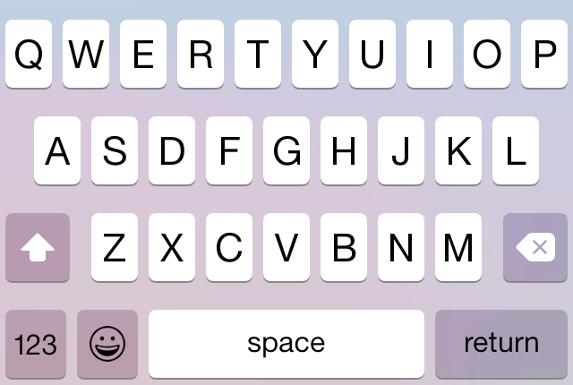
As of Xcode 6.1, you can no longer open 3rd party keyboards in most apps in the Simulator, including your own. (And not just 3rd party keyboards: most system keyboards refuse to show up, too.) Not only does this make debugging a whole lot harder, but it also prevents you from easily making screenshots of your keyboard if you don’t own some of the newer devices. This issue is marked as a bug in Radar, and seeing as how it first appeared in the Xcode 6.1 betas, I cannot fathom how it got through to release.
Fin
There’s no real conclusion. As of iOS 8.1, 3rd party keyboards are functional, but look and feel janky. Programming them is also a horrible pain. I hope Apple fixes this stuff soon. The end.
Thanks for reading! If you’ve found this article or my keyboard project useful, please consider buying something for yourself on Amazon via my affiliate link.
Addendum 2014-11-9: Added paragraphs on visual format language and performance to autolayout section.
-
There were a number of other interesting ways to accomplish the same goal, including Quartz event taps and
.keylayoutfiles. You can check out the code, in various states of completion, in my Github repo. (Warning: gnarly code ahead!) ↩︎ -
If you want to have equal spacing between a set of views, you need to add an equally-sized set of “spacer” views between them. This is the technique recommended in the official documentation. ↩︎
—Archagon
November 8, 2014

