
MusicMessages! Making a Collaborative Sequencer for iMessage
Jan 3, 2017 releases

Last month, I released an unusual little app for iMessage. It’s called MusicMessages!, and it’s a collaborative step sequencer that lets you work on short pieces of music together with your friends. As far as I can tell, it’s the only app of its kind in the iMessage App Store. (Probably for good reason!)
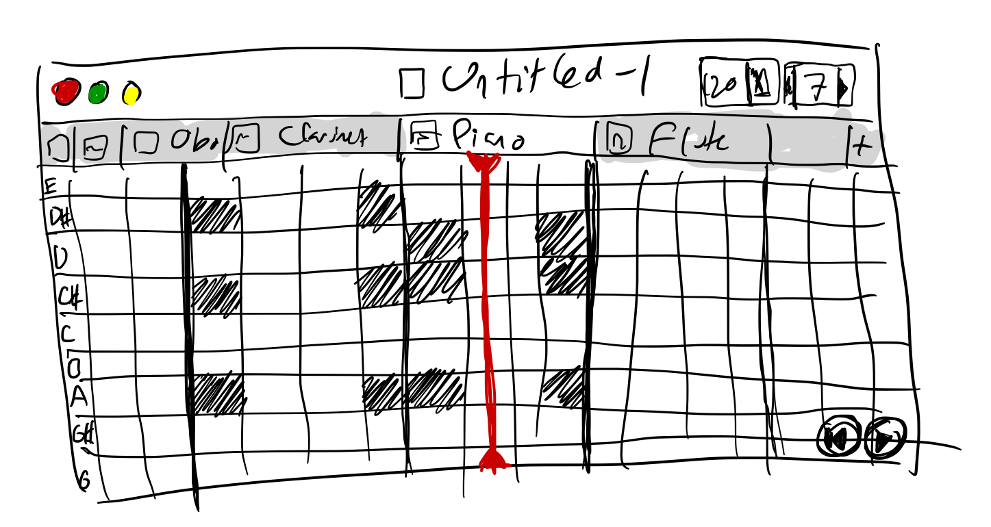
The app presents you with a grid of buttons, each corresponding to a musical note. Time is horizontal and pitch is vertical, and the entire grid can be panned like any other iOS scroll view. To place a note, simply tap one of the buttons; tap it again to erase the note. (If you have a 3D Touch capable device, you can depress the button using finger pressure. On an iPhone 7, there’s even a bit of haptic feedback at the end.) The tabs on top of the screen represent independent layers of notes, and if you tap their icons, you can pick a new instrument out of 40+ different ones (including percussion). Once you’re happy with your portion of the piece, you can send it off to one or more fellow iMessage users for their contributions. Each participant’s notes show up in their own unique color, making it easy to track the changes to a piece over time.
Why iMessage? Since releasing Composer’s Sketchpad, I’ve wanted to create a companion app that would make it even easier to play around with simple musical ideas, though at the expense of expressiveness. Initially, I envisioned this as a tabbed, pannable, Minesweeper-like step sequencer for OSX. But when I started investigating the new iMessage frameworks in iOS 10, I realized that iMessage might be as good a place as any to work out this idea. No sync issues, no file I/O, a format that incentivized short experiments, and plus — the social aspect just seemed neat! Wouldn’t it be fun to riff on a melody or percussion line with your friends?
Total development lasted exactly two months and involved approximately 8000 new lines of Swift code, plus 1000 lines and a bunch of assets borrowed from Composer’s Sketchpad.
Favorite tech bit? The data format! I hate spinning up and maintaining servers, so my aim was to avoid any outside dependencies by sending data strictly through the iMessage APIs. Unfortunately, iMessage sends data via NSURL, which in this case had a hidden limit of 5120 characters. I hit this limit with plain old NSArchiver after about a dozen notes. To solve the problem, I had to compress all my data — 5+ layers, 5+ participants, and as many notes as possible — into approximately 3.75kb, assuming base64 encoding for the data string. Swift is pretty terrible at dealing with tightly-packed data structures (a 256-element static array can only be represented by a non-iterable 256-member tuple) and so I designed a struct and corresponding helper functions for my data in straight C. Lots of fun counting bits and optimizing for maximum data density… eventually, I settled on a maximum of 12 layers, 8 participants, and 1120 notes, along with a ton of extra data and even some room to spare. Nothing terribly complex, but it’s still fun to optimize within tight constraints.
Another feature I enjoyed integrating was the perceptually-balanced HSLUV color space for all my user-selected colors. Normally, if you generate colors in the usual HSB color space by varying the hue and keeping saturation and brightness constant, you get colors that are perceived as unequally bright by the human eye. (An artifact of biology, alas.) Perceptually-accurate color spaces like CIELUV attempt to compensate for this, but most of them have large swaths of empty space where impossible colors lie, making it very difficult to create linear ranges of color parametrized by hue. HSLUV goes one step further and stretches the chroma to fill in these gaps. Not perceptually perfect, but just a ton more convenient and usable in practice!
Since there’s an element of self-marketing in iMessage apps — recipients of app messages are automatically prompted to download the corresponding apps — it was important to make my app free. As I really didn’t want to plaster my interface with ugly ads, I decided to lock some non-critical features behind an in-app purchase. I’d never dealt with this payment model before, and as a complete novice in cryptography the code samples for receipt decryption and validation seemed quite daunting! Fortunately, I discovered an excellent OSX application called Receigen that generated auto-obfuscated receipt and IAP validation headers for my app. Ended up saving what probably would have been several days of frustrating, unrewarding work for just $30. Highly recommended!
![]()
As before, designing the icon was a lot of fun. Just like last time, there was a long period in the middle where I was sure that the right design — one that would equally hint at the interface, functionality, and ambiance of the app — would elude me. And just as before, after a chain of prototype designs that I wasn’t crazy about, the right pieces suddenly snapped into into place all at once. On a lark, I even spent a few days parametrizing and animating the icon for my trailer, adding another 900 lines of code through Swift Playgrounds. (Next time, I should probably use something like After Effects or Flash. Keyframing in code is a huge pain, and performance in Playgrounds is hardly sufficient.) The thrill of creative experimentation and discovery is something I sorely miss in my day-to-day programming and makes me all the more eager to get started on my game project.
Speaking of Adobe, I finally moved on from iMovie to Premiere Elements for my trailer. What a relief! Although deceptively simple at first, PE conceals enormous power in its effects and keyframing features. In trademark Adobe fashion, the program does its best to infuriate you into almost paying for the full CC; but with some clunky zoomed-in Bézier adjustments and begrudging cut-and-paste alignment of keyframe positions, it’s easy to create a video that moves, changes color, and feels very dynamic. The trailer I saw in my head came together in just a few days, and now iMovie feels like a joke in comparison. Well worth the $50 I paid for it on sale.
MusicMessages! was an attempt at a speed project, so there’s many stones left unturned. The UI takes up too much room. The instrument tabs in horizontal mode are too hard to reach. Transitions are jittery and some of the UI glitches out on rotation. There should probably be a chord option for beginners. Percussion is in MIDI order, which is… a little bit crazy. But overall, I’m quite happy with the result! I hope people get a kick out of this weird project and enjoy sending their oddball musical ideas to each other.
One more thing. There’s a good chance I’ll be releasing a standalone, file-based version of the app in the future (with MIDI, IAA, Audiobus and all that good stuff). If you’d be interested in using such an app, do let me know!
—Archagon
January 3, 2017