Rethinking Musical Notation with Composer's Sketchpad
Feb 5, 2016 releases
This blog post is part of a series on the development of Composer's Sketchpad, a new iPad app for making musical rough drafts and doodles.
Just last month, I released my first major project for the iPad: Composer’s Sketchpad!
Composer’s Sketchpad is an interactive, “doodle-y” take on music sequencing and notation. When you launch the app, you’re presented with a giant canvas that can be panned around with your finger. The canvas is covered with a grid, indicating time on the horizontal axis and pitch on the vertical. To draw musical notes, you hold down the canvas with one finger and draw with another. (You can also zoom using a similar gesture.) Unlike most sequencers, the app lets you start your notes at any time and bend them to any pitch, giving you the ability to sketch out twisted solos and complex rhythms with no extra effort. You can also snap to the gridlines if you wish.
In the coming months, I’m going to (try to) post a series of articles concerning the technical, design, and marketing aspects of the project. But for now, I’d like to write about the genesis of the idea.
I made Composer’s Sketchpad for two reasons.
The first was my inability to compose music using the tools I had at hand. Today, with the help of computers, creativity in practically all artistic mediums is blooming. Everything is digital, iterable, undoable: instead of having to buy messy paints or develop your film after every 30 shots, you can open your favorite graphics editor, grab your tablet, and tear through hundreds of sketches at a time. This reduction in creative friction must be an astounding source of growth for the arts!
Unfortunately, I feel composition has not quite made the same magnitude of leap forward. While the studios of the past can now be entirely replaced by powerful tools running on our computers, most of them are dreadnoughts aimed at heavy production or performance use. The rhetorical art of composition — the process of taking musical notes and putting them in an order that sounds good and meaningful to our ears — has yet to see the equivalent of a Word or a Photoshop. To put it another way, there’s very little music software out there with a tight creative feedback loop specifically tuned to plonking down a few notes, playing them back, and repeating the process until you get something that sounds good. You could certainly use a DAW sequencer, Finale, or even a tracker for that purpose — many composers successfully do! — but I’ve found that the delay between editing and playback is still too high in those applications, to say nothing of the often immense UX hurdles. Worse yet, barely any of these tools are optimized for touch or stylus input — surely an ideal interface for composing at the piano (or under a tree)!

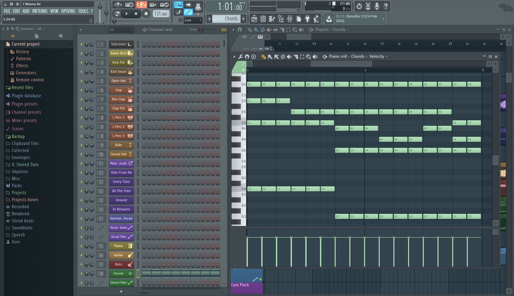
DAW interfaces tend to be aimed at production, not freehand composition.
Tooling aside, many musicians write music by simply improvising on their instrument and recording the results. Sadly, this is not a tenable approach for amateurs. Whenever I’m sitting at the piano and get the flicker of an interesting idea, I always lose the thread by the time I get around to actually playing or writing it down. I’d need many more years of practice to actually be able to compose anything interesting using this approach.
It was clear that my musical life was missing a tool that allowed for the rapid entry and immediate playback of notes — a kind of interactive, audible sheet music. Whenever inspiration struck, I wanted the ability to pull out my tablet or phone and jot down my musical thoughts in a matter of seconds.
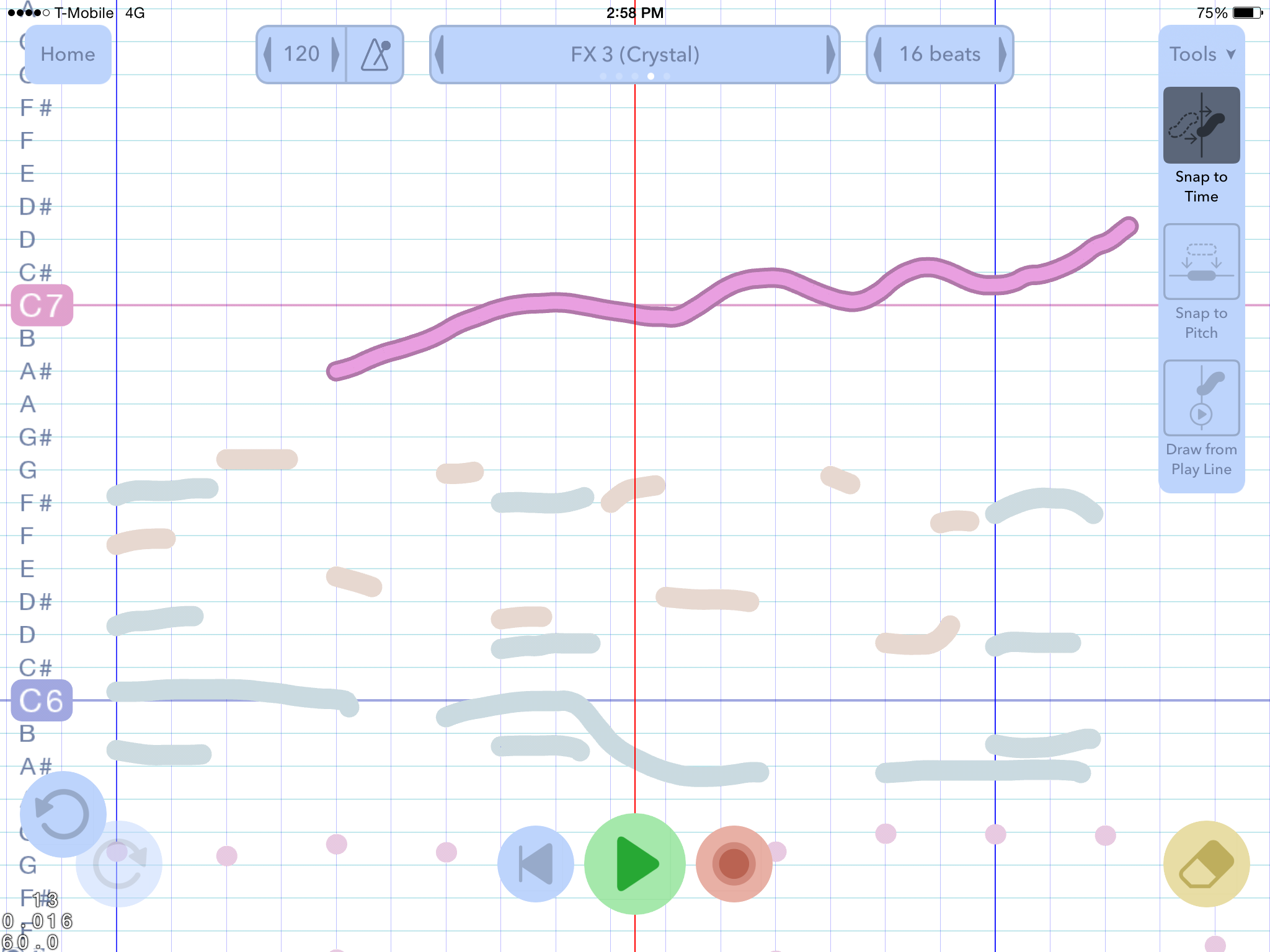
Composer’s Sketchpad fulfills this demand by heavily prioritizing navigation and note entry above all else. There’s no mode for moving around the canvas: you simply swipe like in a mapping app. To make a note, you hold down the canvas with one finger and draw with another, as if applying pressure to a particularly slippery piece of paper. Undo/redo and erase are right there in the corners, and the playback controls are within easy reach at the bottom of the screen. (Your current viewport is also your playback position.) A piece is divided into several layers of notes — each with their own instrument or percussion set — and the active layer can be changed with a simple swipe of the instrument box at the top of the screen. Doing this brightens the active layer and dims any background layers, allowing you to edit the current layer exclusively while still having a sense of what all the other instruments are doing. In short, there’s barely any cognitive overhead: every tool you need to rapidly sketch out music is right there in front of you.

The UI in Composer's Sketchpad is carefully tuned to enable a tight creative feedback loop.
The other problem I wanted to tackle was the antiquated nature of sheet music.
I love classical and popular music alike. Unfortunately, popular music differs enough from classical to make traditional notation simply the wrong tool for the job. For one, practically every piece of popular music uses syncopated rhythm. Most classical music is fairly on-the-beat, and notation is designed with that in mind. With syncopated music, you usually end up with a mess of rests, ties, and dotted notes that is hard to read and write. Modern music is also irreverent when it comes to duration and pitch. Solos are a great example: they’re fluid and expressive, and each note only lasts and remains on pitch as long as the performer wishes. Once again, notating them is an incredible pain.
What about music from other cultures? The scales for many musical traditions differ vastly from our own. Simply put, their notes fit between our notes! Composers shouldn’t have to switch their system of notation just to play around with different kinds of music.
What about our own (Western) myriad of different scales and tunings? We’re so used to Equal Temperament that we’ve completely forgotten the incredible polyculture of tunings in early music, to say nothing of the microtonal experimentation of the 20th century. Indeed, the Scala microtonal tuning archive has over 4000 scales! All impossible to convey with traditional notation.

An excerpt from "Comfortably Numb". Solos are cumbersome to write out using traditional notation.
Instead of trying to shoehorn all music into a Western style of notation invented several centuries ago, it occurred to me that maybe an entirely new approach was needed. In fact, why encode the music at all? The barest, most obvious form of notation is a graph of time and pitch. This system would have been too difficult for musicians to read from and write to back in the day, but that’s not really an issue when the music can play itself and your musical canvas is tactile and effectively infinite. It seemed like the best shot at covering all bases.
In Composer’s Sketchpad, each “note” is a simple array of times and pitches. Note names, measures, and time signatures still exist, but only as a grid or stencil over the absolute time/pitch graph — a feature of the tooling, not an intrinsic part of the piece. You use the current scale and meter grid to align and snap your notes, but you can also change them up for use in later sections without having to worry about your existing music. Under the hood, it’s all the same: scattered little point clouds of absolute time and pitch.
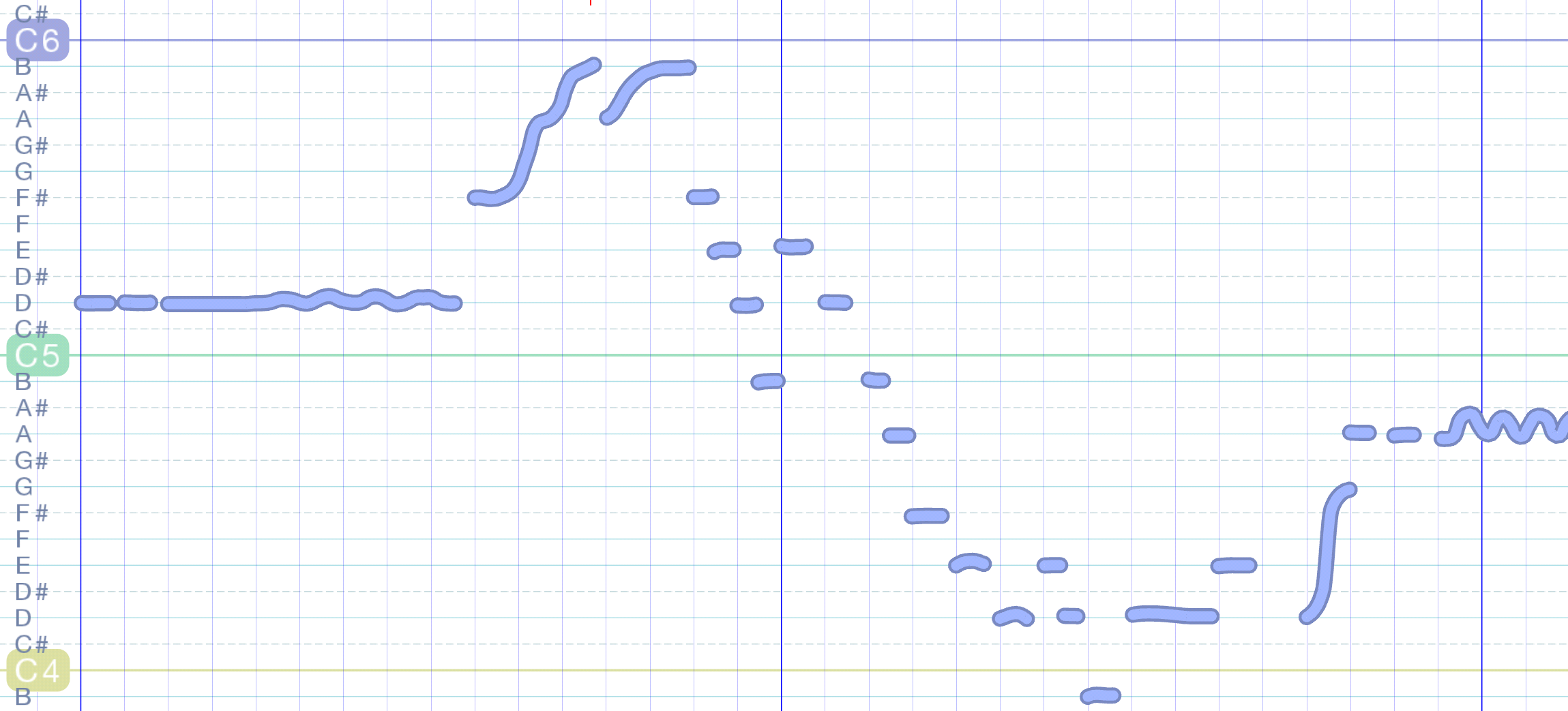
As a result, writing out complicated and expressive sections of music in Composer’s Section no longer feels like caging a canary. The grid is your friend, not an oppressive bureaucrat. If you want to write more conventional music, snapping to time or pitch works just as it did with traditional notation. But turn snapping off and you can bend your notes or extend them out to the exact length of time needed. Because the shape of your notes corresponds exactly to their time and pitch, a quick glance at your music tells you exactly how it’s going to sound without having to decode a mess of symbols in your head. And you can edit any part of any section or overlap as many notes as you like without having to worry about fulfilling the “note quota” of a measure, as you constantly have to do in sheet music apps like Finale.

"Comfortably Numb" again in Composer's Sketchpad, transcribed by ear. This style of notation is great for conveying expressive melodic lines.
And now, a bit of a pretentious digression, as well as a few words about the future of the project!
Most programmers today are very excited about building for the web. Each day, the front page of Hacker News is filled with stories of up-and-coming web-based startups as well as new Javascript frameworks and libraries. There’s also a lot of related talk about how pay-to-own software is going away, and about how subscriptions, in-app purchases, and advertising are going to replace them.
Speaking strictly for myself, I can’t stand the idea of my software residing permanently on other people’s servers or relying on money from other people’s products. For every new and exciting startup that I read about, there’s a related story of yet another acquisition or shutdown flushing years of work down the drain. What were all those man-hours, well-intentioned ideas, and midnight flashes of inspiration good for in the end? No, that style of development is not for me. I don’t want to create services, networks, or support organizations; I want to create beautiful objects, little bits of clockwork that are both lovely and useful in their whole. Once they’re made, I want to be able to take my hands off them and let them live without my further involvement. I’m not interested in running servers or providing exciting new content patches week after week. You pay once — you get the object. There is certainly room for updates, but only in the interest of making the object better.
I’m still far from that ideal — for example, in-app purchases might be tempting down the line — but that’s the direction I want to head with my current and future projects.
Composer’s Sketchpad isn’t a profit-driven venture looking for a market or buyer. It’s one of those objects that didn’t exist in the world before I made it, and its reason for being is to help me be creative. I plan to add many new features over the years as my compositional needs develop, and I hope that eventually I’ll be able to port it to other platforms and release the source code for everyone to use. It’s a tool from my own personal toolbox that I’m happy to put out into the world.

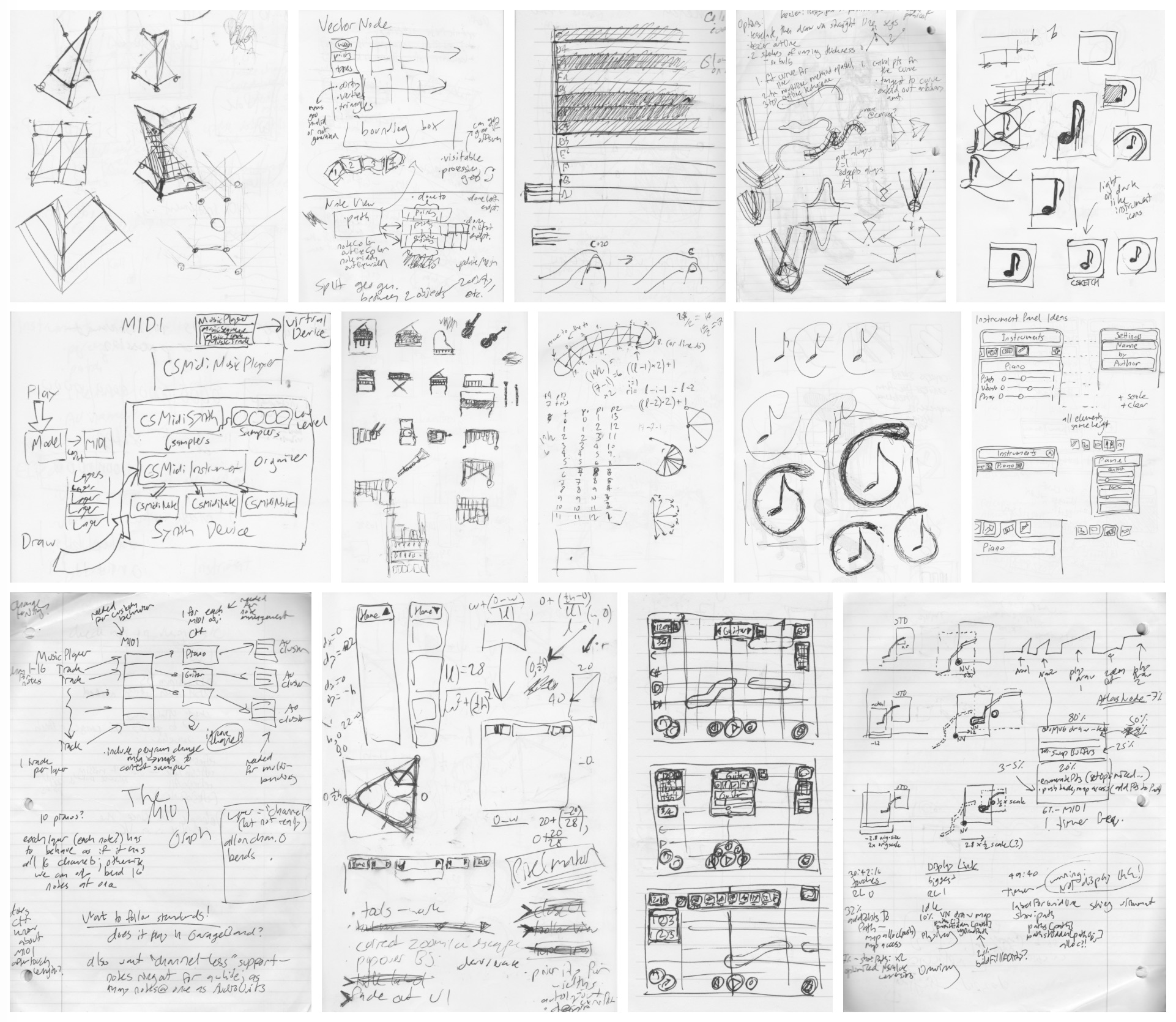
Some of the many design sketches made during development.
Using cloc, the project comes in at around 20,000 lines of code. This is a massive leap for me, and I’m incredibly excited to get started on the next 20,000!
—Archagon
February 5, 2016
