
Composer's Sketchpad: Adventures in Icon Design
Jul 16, 2016 design
This blog post is part of a series on the development of Composer's Sketchpad, a new iPad app for making musical rough drafts and doodles.
Composer’s Sketchpad 1.2 is out! This is a major update with several new features, including audio export (via AAC), a new tool for shifting notes along the time axis, and a one-finger drawing mode. I figured this might be a good opportunity to write about something a bit more on the creative side: icon design!
Having no practical design experience, I am very proud of the icon I created for Composer’s Sketchpad. A good icon is absolutely essential for marketing, so most app developers would recommend contracting out this delicate task to a real designer. But I’m stubborn: one of my higher-level goals in creating Composer’s Sketchpad was to get better at art and design, and I wanted the icon in particular — the thesis of my app! — to be my own invention.
Going along with the idea that creativity flourishes under harsh constraints, these were the requirements I laid out for the icon:
- It had to feature a reference to music.
- It had to hint at the functionality, aesthetics, and interface of the app.
- It had to roughly align within the iOS 7 icon grid while somehow subverting it.
- It had to exhibit some dimensionality and flow. I didn’t want it to look flat or overly vectory.
- It had to be logo-like: symbolic, bold, and simple.
- But most importantly, it had to immediately catch the eye. As a frequent App Store customer, I knew well enough that even a slightly uninteresting app icon would warrant a pass, while an interesting icon might make people peek at the app description without even knowing anything about it. The icon was absolutely critical to my passive marketing. It was my calling card — the entirety of my app wrapped up in 512×512 pixels. No pressure!
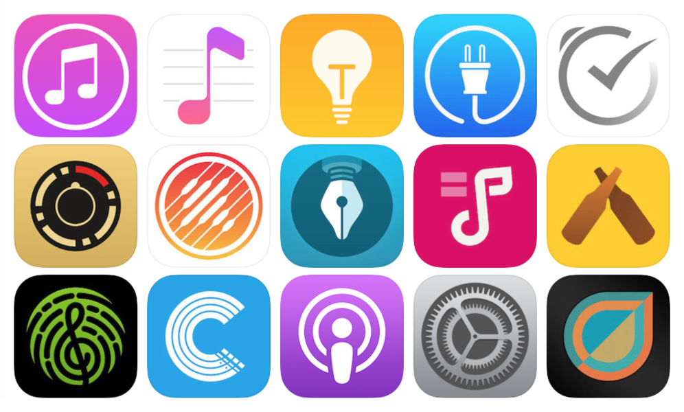
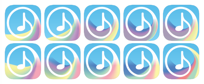
Weeks before starting work on the icon, I began to keep tabs on other app icons that I found interesting. I was already following musicappblog.com religiously for music app news, so I scoured their archives for inspiration. I also carefully looked through all my home screens as well as the App Store top charts for non-music influences. In truth, even among the cream of the crop, there weren’t many icons that I outright loved. Most of the ones that caught my eye kept things relatively simple — outlines, primary colors, subtle gradients — while preserving the circular motif of the iOS 7 icon grid. (Many of these happened to be Apple icons.) There were also plenty of icons that failed at either extreme, either by cramming too much color and detail into the tiny square, or by not providing nearly enough detail to make a minimalist design stand out.
A few app icons I would consider eye-catching.
Inspiration in hand, I first made a number of rough pencil sketches, most of which depicted a prominent musical note with some embellishment. Quality was not a concern at this point: I wanted to jot down as many ideas as possible even if they didn’t seem to hold much promise. In the midst of this process, I found myself feeling fairly ambivalent towards most of the designs I came up with, though I knew they could probably be moulded into something that followed my rules. Something about them just didn’t feel right.
I still didn’t have much of a sense how far my nascent design sensibilities could take me, and part of me started to give up hope of finding the perfect design. But when I came up with the sketch for the final swirly-tail icon (after running a few ideas by my folks — спасибо, мама!), everything suddenly clicked. I knew right then that this particular design would perfectly slot into the narrow niche defined by my requirements. For the first time, I thought that maybe I could pull this off!
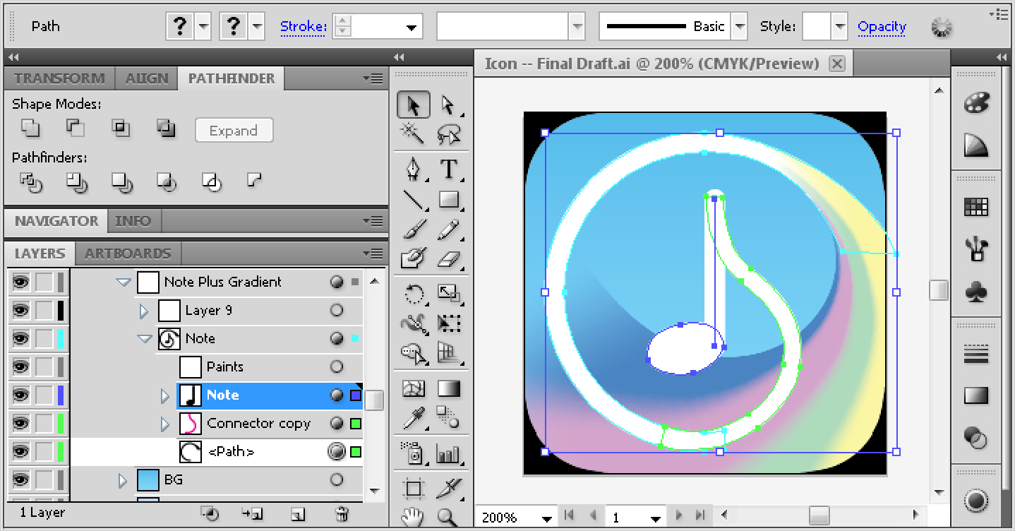
After making a few passes at the basic shape in pencil, I moved to the computer. My first attempts at a colored draft were very static. Doodling in Pixelmator with my Wacom tablet got me effectively nowhere, so I decided to just work in Illustrator directly — my first real stint with the software. As was typical with Adobe, the UI felt like a sprawling, bloated mess, but also allowed me to do some surprisingly powerful things. The most important discovery were the non-destructive transforms — particularly for the Pathfinder — in the inconspicuous “fx” menu at the bottom of the Appearance tab. With these tools, I gained the ability to perform boolean operations on sets of shapes, turn strokes into paths, and create complex gradients while still having full control over the constituent parts. Doing this across complex groups of layers wasn’t pretty, but it allowed me to freely experiment with new shapes without having to “bake” a final result and start all over again for minor adjustments.
I’m sure experienced vector artists can use Illustrator to draft their ideas directly, but my process, as a beginner, was much more methodical. I started with the standard iOS 7 grid and drew a simple circle over the outer part. I typed an 8th note symbol in the center and looked through many fonts to find a pleasing shape for the flag. I rendered the note as a shape, added a scan of my freehand sketch in the background, and started dissecting the circle; it was split into several sections to make joining with the note flag a bit easier. After placing a connecting Bézier curve between the flag and the circle, fiddling with the control points to match my sketch, and adjusting the width to smoothly blend the circle and the flag, I had an outline that roughly matched my paper drawing. For this first pass, the rest of my time involved zooming out and adjusting the widths and tangents to make sure that everything looked smooth and contiguous.
Some early experiments.
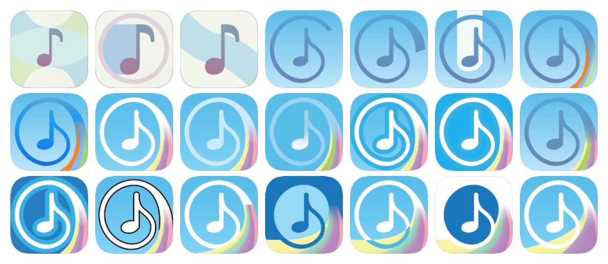
Designing the colorful swish at the tail end of the circle came next, and it turned out to be the trickiest part of the process. I knew that this segment of the icon had to have flow, levity, and dimensionality without looking too realistic or skeuomorphic — and yet I couldn’t picture it in my head. I started with a simple 3-color gradient at the end of the circle that widened towards the bottom. This looked merely OK, but it felt too static. Adding more colors to the gradient and moving the left side of the tail into the circle helped, but it wasn’t enough.
The first problem was nailing the outer curve of the tail. I tried many different shapes. Some looked like paintbrushes; some evoked waves; some resembled sand dunes. But none felt perfectly right. My “aha” moment was when I realized that I was subconsciously creating an Archimedean spiral with its origin at the note flag. I borrowed a spiral from Google Images and adjusted my curves to fit it. The shape finally came together.
Next came the colors. I learned that I could add more control points to the bottom of the gradient envelope, allowing me to roughly specify the curve of each vertical slice of the gradient. The next few iterations involved creating an almost cloth-like shape out of the envelope and fiddling with the blur between the gradient colors. Still, the distribution of the gradient stripes was unsatisfactory. No matter how much I adjusted the gradient distribution or the control points of the envelope, the swirls felt too busy at the origin and too lopsided further towards the bottom.
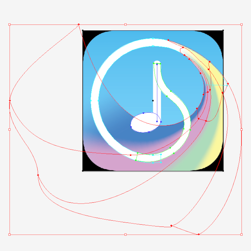
Rough drafts closer to the final icon.
I realized that what I wanted was precise control over the “density” of the gradient envelope, top to bottom. Hoping that Illustrator contained within its multitudes the solution to my problem, I Googled around and was elated to discover that I was correct. The Gradient Mesh tool, though a bit tricky to set up, allowed you to apply a gradient to a flexible rectangle with an inner Bézier-based grid. I could now adjust the precise distribution of color throughout the entire length of my tail!
There were still some shape-related questions to answer, the most important being: how do I maintain the legibility of the note and circle? The tail was supposed to be in the background; above all else, I didn’t want the shape or colors of the tail to interfere with the appearance of the note. Initially, I assumed that the left edge of the tail (touching the blue stripe) should avoid the note head entirely by going under or above it. However, both options made the tail look misshapen and unattractive, ruining the wave effect. On a whim, I tried intersecting the note head with the edge and it worked! Instead of disrupting the legibility of the note, the line drew the eye to it. I also had concerns that the gradient would make the lower part of the circle hard to see, but this was easy to fix by simply following the shape of the circle with the red stripe.
Finally, I wanted to make sure that each curve in the tail — the left edge as well as each dividing color line in the gradient — “rhymed” with the overall shape of the icon. The final curves were mostly determined by trial and error. Just as with my initial sketch, I “knew” as soon as I saw the winning arrangement that I had found an inflection point for my design. There was a strong sense of motion originating from the note flag, carrying through the circle, and spiraling back around into a colorful background wave. Even though I couldn’t picture it at the time, it was exactly the effect I was hoping for when I originally came up with the design!
(I wish there was more to say about color selection, but in truth, it was done quickly and somewhat haphazardly. The background blue was derived from the primary color of my app, while the gradient colors were basically chosen on a whim.)
The final curves of the gradient mesh.
For the Lite version, I once again wanted to stick to App Store conventions while defying them just a bit. Most Lite icons have an ugly banner over the default icon that feels out of place with the rest of the design. I still wanted to have the banner for consistency, but I wanted it to work with my diffuse pastel aesthetic.
First, I had to determine banner placement. I tried several of the usual positions and then quickly rejected them; they blocked off too much of the underlying icon. I then decided to give the diagonals a shot and discovered that the upper-right corner had several benefits: not only did it preserve visibility for the key parts of the icon, but it also complemented the motion of the circle while allowing some interesting colors to peek through. (Assuming some translucency, which felt likely.)
Next, I had to find a good look for the banner. (This iteration was done in Photoshop, since its raster effects were far better than Illustrator’s.) A simple color fill felt too out-of-place, so I decided to try for an iOS-7-ish Gaussian blur; ideally, I wanted a bit of the white outline and some of the tail colors to show through without compromising legibility. To make it easier to pick the final position, I masked the banner onto a blurred render of the underlying icon, which allowed me to treat the banner as if it were simply a blurry window and move it around freely. It didn’t take long until I found a satisfying result.
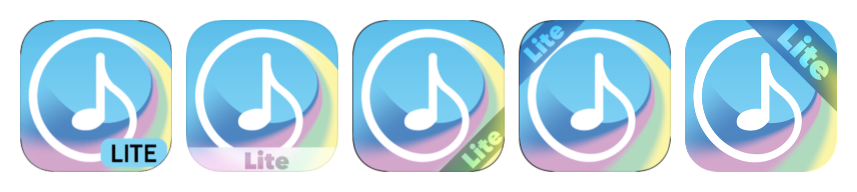
Drafts for the Lite version of the icon. The final icon is on the right.
That’s about it! Against all my expectations when I started on this journey, I’m still pleased by my icon whenever I catch it on the home screen even half a year later. There are certainly changes I could still make — there’s not enough contrast, the colors aren’t perceptually balanced, the gradient divisions are still a bit lopsided and the origin of the swirl needs some work — but I would consider these nitpicks. The gestalt of the design is right.
(And as an unforeseen bonus, the icon easily converted into a black-and-white stencil for the promo poster a few months later!)
If there’s a foremost design lesson I took a way from all this, it’s how many moments of inspiration occurred whenever I deviated from incremental adjustments and tried something more extreme. Adding a bit more curvature to a line didn’t yield any new insights; but turning it into a semi-circle gave me a completely new perspective on the shape. Changing the brightness slightly didn’t result in a satisfactory color palate; while ramping the slider completely made me rethink my initial assumptions about the chromatic balance. It seems that if you’re stuck in a design rut, it can be a good idea to vastly overshoot and then dial down instead of trying to inch towards an optimal design with minor, conservative changes.
Ultimately, it felt wonderful over the course of this project to engage with my creative side — a part of myself that I still consider a mystery. Every time a design decision “clicked”, it felt like a little miracle. No doubt this will only reinforce my stubborn desire to do all my own art in future projects!
—Archagon
July 16, 2016